
Color choice within the realm of product design is an art. It’s not just about aesthetic appeal, it’s about evoking the right emotion, setting the mood, and often, making a bold statement. For crafters, each color is a thread in the fabric of their creation, setting the tone and telling a story.
The right palette can turn a simple sublimation design into a whimsical treasure, or a custom creation into a memorable centerpiece. Color is the silent salesperson and the visual language communicating the essence and personality of the product. It’s your ticket to creating pieces that are not just visually delightful, but products and designs that resonate on a deeper level with your audience.
Let’s not forget, a well chosen color palette can be the difference between a product that blends into a marketplace, and one that’s snapped up faster than free samples at Costco!
What is Color Psychology?
Within sublimation printing, every hue printed onto a product is more than a mere aesthetic choice, it’s an interaction between the design and the observer’s psyche. Color psychology, the study of how colors influence human thoughts, emotions, and behaviors, plays a pivotal role in this interaction.
Colors aren’t just aesthetic, they communicate, evoke feelings, and even drive actions. Whether it’s a vibrant red that stirs excitement or a cool blue that soothes, understanding color psychology is crucial for creating sublimation products that resonate with the audience¹. As a sublimation pro, hobbyist or crafter, harnessing the power of color psychology in your designs is not just an art, it’s a science that can significantly impact the appeal and success of your products and designs.
Color Theory 101
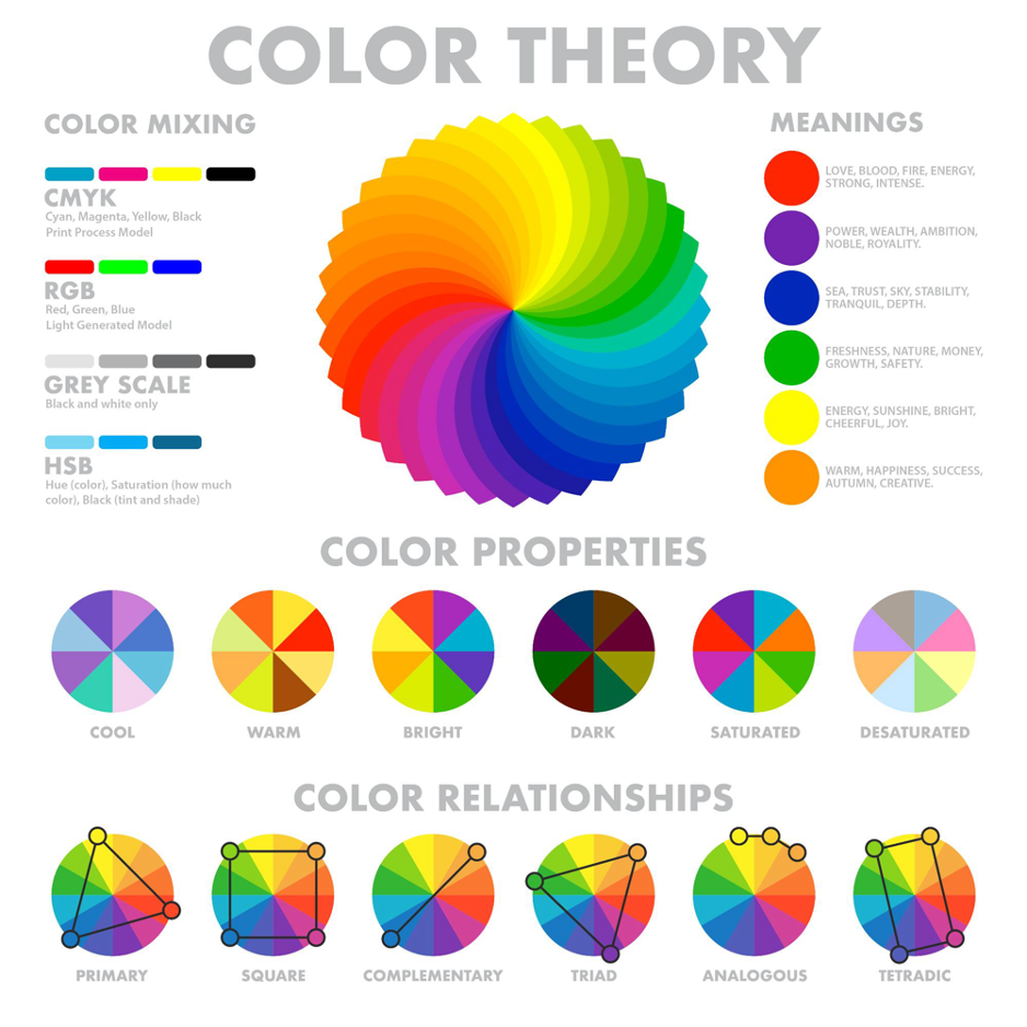
Color Basics
At the heart of the color wheel, reside the three primary colors: red, yellow, and blue. These fundamental hues cannot be created by mixing other colors. They stand as the foundation from which all other colors emerge.
From the union of primary colors, secondary colors are born. Orange, the child of red and yellow, bursts forth with warmth and energy. Green, the offspring of blue and yellow, exudes tranquility and harmony. And violet, the progeny of red and blue, radiates mystery and sophistication.
The color wheel’s story doesn’t end there. Tertiary colors, the grandchildren of the primary hues, emerge from the blending of a primary color with its neighboring secondary color. Red-orange, yellow-orange, yellow-green, blue-green, blue-violet, and red-violet. These six hues add depth and nuance to the color spectrum.
Understanding the relationships between primary, secondary, and tertiary colors is the key to unlocking the secrets of a magical palette. With this knowledge, you can create harmonious color schemes, evoke specific moods, and bring your artistic visions to life.
Harmony and Contrast
In the grand symphony of color, harmony and contrast play a captivating duet. While harmony is typically an arrangement of colors that soothes the eye, contrast introduces a dynamic tension that captures attention. Together, they orchestrate a visual dance that captivates the senses.
Color harmony is comprised of analogous colors, complementary colors and triadic colors. Analogous colors, neighbors on the color wheel, create a sense of serenity and flow. Complementary colors, positioned opposite each other, provide a vibrant contrast that electrifies the senses. And triadic colors, three evenly spaced hues, offer a balanced and vibrant composition.
Color contrast on the other hand, introduces a bold counterpoint to harmony’s gentle melody. It’s the sharp drumbeat that adds excitement and energy to the visual composition. High contrast, like a bold exclamation, uses starkly different colors to create a striking visual impact. Low contrast, like a subtle whisper, employs closely related hues for a more subdued effect.
The art of combining color harmony and contrast lies in understanding their interplay. A harmonious palette can be spruced up with a touch of contrast, while a high-contrast scheme can be tempered with harmonious elements. It’s a delicate balance, a dance between visual tranquility and excitement.
By mastering the concepts of color harmony and contrast, you can become a composer of visual experiences. You can evoke moods, guide attention, and create compositions that resonate with our audience.
Concept to Creation
Now it’s time to take these concepts and turn your passion to profit. With the innovative MySawgrass design tool, you have the power to transform your products into works of art by harnessing a vast collection of professional designs. DesignMate also allows users to create custom branded pallets.
Creating a custom brand palette in the design tool is crucial for creators looking to open a store in MySawgrass or anyone aiming to maintain brand consistency across all their visual content. By integrating a custom brand palette, you can ensure that your brand colors are accurately and consistently represented in each design. Having a custom brand palette readily available, streamlines the design process, saving time and effort in selecting and applying brand-specific colors to the thousands of designs within the MySawgrass design tool.
This versatile tool allows you to seamlessly integrate these designs with your products while retaining the flexibility to make them uniquely your own. Whether it’s altering text, experimenting with colors psychology, or entirely reworking the design, customization knows no bounds. To fully utilize color psychology and connect with your audience, use every tool at your disposal.
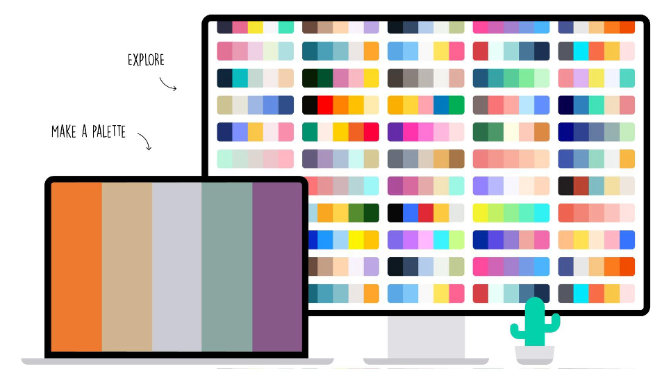
Consider tapping into color pallet tools like colors.co or colorhunt.co to effortlessly generate custom color palettes. Eliminate the guesswork and dive into the realm of color psychology. Using pallet generators not only enables personalization based on your intent but also ensures that the final product resonates with your target audience on a profound emotional level, making each creation a masterpiece that’s as individual as the crafter behind it.
Tips to Consider
- Understand Your Audience and Have Intention: Begin by understanding the demographic and preferences of your target audience. Different colors can evoke varying emotions and responses in different groups, so tailoring your color choices to your audience is key. To get a deeper understanding of how specific colors can provoke different responses, check out colorpsychology.org. Use intention with your color selections to make sure to get the response you are looking for.
- Keep it Consistent: Maintain a consistent color scheme across all elements of your product design, from packaging to advertising. Consistency builds brand recognition and reinforces the emotional associations tied to your brand’s colors. Using an array of colors in your designs is great, although adhering to a brand aesthetic will help with your product recognition. Consider sticking to your brand palette within DesignMate for the majority of your designs.
- Don’t Forget Balance and Contrast: Create visual interest by balancing and contrasting colors strategically. A harmonious blend of complementary colors can make a product visually appealing, while contrast can draw attention to specific elements. Use these tools when creating products that you want to pop or adhere to a season or theme.
- Consider Cultural Significance: Be mindful of the cultural connotations of colors. Colors can have different meanings in different cultures, so research and adapt your color choices to avoid unintended misinterpretations.
- Test and Iterate: Don’t hesitate to test different color combinations and designs. Conduct research, create multiple iterations of your designs and gather feedback from friends and family to ensure your color choices align with the desired emotional response as well as your brand identity.
By applying these tips, you can harness the power of color psychology to create products that not only look visually appealing but also resonate with your audience on a deeper level.
Print Vibrant Prints Every Time
We know color psychology can be hard and printing consistently can be even harder, that’s where the Sawgrass Print Utility comes in handy. The Sawgrass Print Utility stands out as an exceptional tool for consistently producing vibrant prints, thanks to its advanced features that simplifies and guarantees exceptional results in every sublimation project.
The print utility features a user-friendly and customizable interface, making it accessible for both novices and experienced users alike. The customization options are extensive, allowing users to save custom paper sizes and use multiple color profiles for optimal output on various surfaces like ceramic, wood, and textile.
The Swgrass Print Utility is compatible with popular software like Adobe and Corel, along with support for a wide range of graphic file formats. The Sawgrass Print Utility’s advanced color management tools, including custom colors, spot colors, palettes, and color sliders, ensure precise color matching and reproduction. The print utility takes years of sublimation experience and allows you to focus on what matters, making professional and vibrant products with ease and efficiency.
Time to Stand Out
In the colorful world of sublimation design, understanding the nuances of color psychology is your key to unlocking success. From evoking the right emotions to enhancing brand recognition, the strategic use of colors can make your designs truly stand out. So, as you embark on your creative journey, remember that the spectrum of success lies in your hands, and the possibilities are as endless as the colors in your palette. To get started, create your MySawgrass account, browse the thousands of professional designs, make them your own and turn your passion to profit.


